Martin Elfers
CREATIVE DIRECTION + DESIGN

Hi!
I’m a creative director and designer building brands, campaigns, and content that actually lands.
Brand-focused thinking.
Editorial roots.
Still hands-on.
There’s been so much work over the years,
here’s a drop in the bucket to get a taste!
a few branding highlights
KIN PROJECT SCOPE
PROBLEM
A lot of activewear feels loud, overdesigned, or trend-driven. I wanted to see what happens when you strip that back and build something that feels more considered — something you’d actually want to live in, not just train in.
EXECUTION
I built the brand from the ground up — logo, mark, typography, color system, and overall visual language. The identity leans minimal, with a focus on proportion, spacing, and subtle detail. From there, I applied it across apparel, tags, and campaign visuals. The copy stays simple and direct, reinforcing the idea of moving with purpose. I also developed a series of motion concepts and video prompts to bring that sense of kinetic energy into the brand without overcomplicating it.
SOLUTION
What came out of it is a clean, flexible system that feels elevated but not precious — something that works just as well on a garment as it does in a campaign or retail environment. The focus stays on movement, intention, and restraint.
RESULT
What came out of it is a clean, flexible system that feels elevated but not precious — something that works just as well on a garment as it does in a campaign or retail environment. The focus stays on movement, intention, and restraint.


PSYKED PROJECT SCOPE
PROBLEM
For Strawberry Spectrum, the goal was to launch with something that felt just as energetic, but more considered. Cleaner, sharper, and more in control — without losing impact on shelf or in campaign.
EXECUTION
I developed the brand and launch system end-to-end — logo, identity, packaging, typography, and campaign direction. The core idea was contrast: a bold, expressive mark paired with a disciplined layout system built around Gotham to keep everything grounded and consistent. From there, I extended the system into launch assets — print, digital, social media and motion.
SOLUTION
The brand lands in a space that feels both elevated and high-performance. It’s energetic, but not overwhelming. Designed, not decorated. Every touchpoint — from bottle to campaign — works as part of a clear, cohesive system.
RESULT
Strawberry Spectrum launches as a distinct entry in the category — modern, confident, and immediately recognizable. It holds its own on shelf, translates cleanly across platforms, and sets a strong foundation for the broader PSYKED line to scale from.


NECTAR PROJECT SCOPE
PROBLEM
Lip care is crowded—either overly clinical or leaning too hard into “natural” in a way that feels generic. The challenge was to create a product that felt rooted in real ingredients, but presented through a more elevated, design-driven lens. Something that could sit comfortably in a premium retail environment without losing its warmth.
EXECUTION
I led the creative from end to end—branding, packaging, copy, and visual direction. The identity centers on a refined serif with a bit of edge, paired with a deep moss green and soft gold palette to bring in richness and tactility. Packaging was designed to feel substantial and considered, with subtle texture and restraint doing most of the work.
SOLUTION
A cohesive, premium brand that bridges natural ingredients with a more editorial, fashion-aware presentation—clean, but not sterile. Elevated, without feeling distant.
RESULT
NECTAR launches as a fully realized product experience—branding, packaging, imagery, and motion all aligned. It stands out by doing less, but doing it with intention—creating a brand that feels considered, modern, and quietly confident on shelf and in campaign.


ELEVATED SOCIAL REELS
PROJECT SCOPE
The beauty industry is always looking for elevated content to push their engagement on social media. I shot these in studio pushing two of the businesses favorite cleansers. We wanted the content to be very intimate, utilizing lots of 240 fps motion, and certain frames slowed down even further with Optical Flow. Adding some animated text and sound fx to finish them off (hover for sound!).


a few editorial highlights
CANNABLISS
PROJECT SCOPE
A four-issue, 100-page custom publication exploring cannabis through a modern, elevated lens. I led the project end-to-end—developing the visual identity, typography system, and editorial framework while designing every page across cover, feature stories, and advertising. The work balances refined layout, considered pacing, and striking imagery to position cannabis within a premium health, wellness, and lifestyle space.


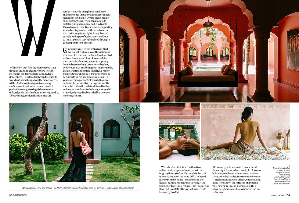
VARIOUS EDITORIAL
PROJECT SCOPE
A selection of editorial layouts spanning features, and long-form storytelling. Built on a foundation of typography, pacing, and visual instinct—work that continues to inform how I approach brand systems and campaigns today.


Opening Spread
Spread 2

Spread 3
Opening Spread


LUXE EDITORIAL
PROJECT SCOPE
At Luxe Interiors + Design, I led creative across all national titles, overseeing cover design, full-scale redesigns, and the development of high-impact special issues. I unified and streamlined the design department, establishing a cohesive visual language and workflow across publications. My role balanced concept and execution—elevating the brand’s editorial presence while building a more efficient, collaborative team structure. Here's just a tiny taste of some highlights!


SPECIAL INTREST PUBLICATION DESIGN
PROJECT SCOPE
I spent a few years deep in the world of special interest publications—designing everything from bold, high-impact covers to full books cover to cover. While cover design was always a focus, I was just as involved in shaping entire issues from start to finish—concepting, pacing, typography, imagery, all of it. The range was wide—travel, shelter, celebrity, food, fitness—each project with its own tone and audience. It was fast, hands-on work that sharpened both my instincts and my versatility as a designer.